Kaggle Otto Challenge — Introduction
25 May 2015
I have recently participated in Kaggle’s Otto Challenge and got in the top 10% on the leaderboard. It was a fairly standard classification challenge, where a class of a product was predicted based on 93 numerical features. I will gradually write a couple posts about the methods I used, but here is a brief summary:
Mainly, I used a combination of scikit-learn’s Gradient Boosting Classifier (GBC) algorithm with nolearn’s deep artificial neural network. In addition to the standard grid search for hyper-parameter tuning, I engineered new features. At the beginning I experimented with Principal Component Analysis, but discovered that it did not improve algorithms’ performance. Instead, I engineered new features looking for interactions between the most important predictors from the GBC’s feature importance list. Next, I did some semi-supervised clustering using DBSCAN library, assigning datapoints from both training and testing datasets to a number of automatically generated clusters. This helped with the algorithms’ performance quite a bit.
The final step was combining the results from GBC and nolearn. After printing out a confusion matrix for each algorithm, I weighted the contribution of each algorithm’s prediction accordingly.
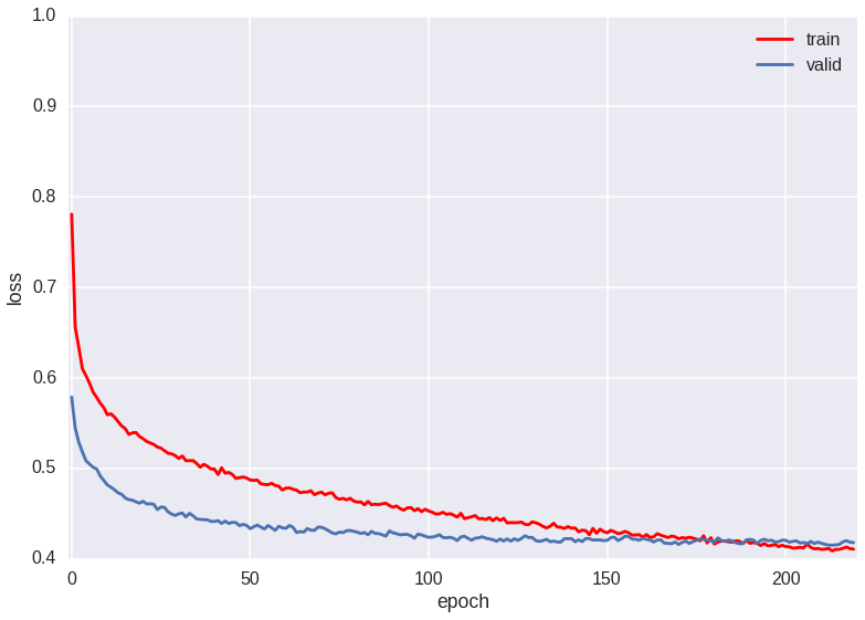
My final score (log-loss) was 0.42671 on the public leaderboard and 0.42912 on the private one. Throughout the competition, I moved from being in the bottom 25% to top 10% of the leaderboard (at one point I was in the top 3%, but in the final few days a rush of new submissions pushed me down a bit).
I learned quite a bit from this experience and recommend participating in Kaggle challenges to anyone interested in both practicing machine learning on real-world datasets (with the obvious caveats about cleaning data, importance — or not — of marginal improvement, etc.) and learning the underlying theory (I will post some links on the open-source resources that helped me throughout this competition as well).
As I mentioned, I plan to talk in some detail about the methods I used over the next few posts, but if you’re interested in an advance preview, take a look at the IPython notebooks.
In terms of Kaggle competitions, my plan is next to form a local team and try out collective hand on the CrowdFlower Search Relevance challenge.
I would like to thank Chicago Python (ChiPy) User Group for allowing me to participate in a mentorship program, where I received a lot of advice and guidance from Eric Meschke, a local Machine Learning enthusiast working at Chicago’s Mercantile Exchange (Eric and I are forming a Machine Learning discussion group and will be working together on Kaggle challenges as a team with a few additional members; so, if you’re in Chicago area and would like to join, let us know).
